I designed the union cards for the graduate union at Indiana University. I think the cards are sick.
The emojis (✍️ ⚡️ 🌷) are writing, power, and the tulip, which is IU specific. The whole card is meant to be a cross between the text on back of an electrical adapter and an IWW Stamp, but like, extruded through ultra-flat techno-minimalism.
Isn't it odd how the major aesthetic move of the 2010s was flat, thin, minimal, and the rejection of that style isn't the resurgence of skeuomorphism, but like, to make the flat minimal things thicker. The 2020s is having a little dalliance with super-bold super-wide fonts like Apple releasing San Fransisco Extended in 2022. I think its neat, but I think the vibe is better accomplished with something a little more blurry and less *c r i s p* like this logo which makes the edges soft so it feels very inky. It gets away from the pixel-precision of a project like Inter (which don't get me wrong is a triumph of open source design, honestly) and towards like a digital design which bleeds (inky is the best work I have sorry).
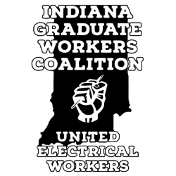
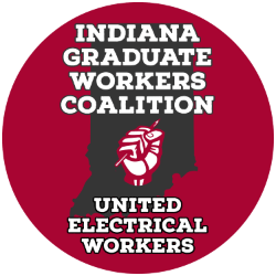
I've been fucking around with the IGWC logo (not mine) trying to push it towards that sort of inky softness which you can see below. The one in black is my "edit" which is just recoloring and slowly creating some weird softness vs. the original.


It doesn't come through that well on screen, but it really comes through in print. I wonder about the influence of high pixel density on these sorts of aesthetics. The nostalgia isn't "artisan" or "handmade" but simply not pixel-perfect. Anyways look at that union card.
